
The 60/40 portfolio (60% equities, 40% bonds) has been the institutional default for half a century. The premise was elegant: stocks provide growth, bonds provide ballast, and their negative correlation smooths the ride. For three decades, that premise delivered. From 1982 to 2021, declining interest rates turned bonds into a perpetual tailwind that bailed out equity drawdowns and compounded quietly in the background.
That era is over.
The question is no longer whether the traditional 60/40 works. It’s what replaces the 40.
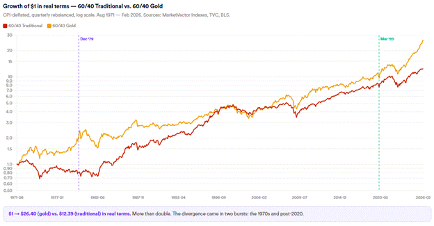
The chart that frames everything
Consider two portfolios, both launched in August 1971, the month Nixon closed the gold window[i] and unanchored the dollar from its last real-asset tether. Both hold 60% in the S&P 500, rebalanced quarterly. The only difference is the other 40%:
Portfolio A: 60% S&P 500 / 40% US 10-Year Treasury (the classic)
Portfolio B: 60% S&P 500 / 40% Gold
Over the full 54-year history through February 2026:
60/40 S&P/Treasury |
60/40 S&P/Gold |
|
Real growth of $1 |
$12.88 |
$26.53 |
Real return (ann.) |
4.8% |
6.2% |
Volatility |
9.9% |
12.1% |
Max drawdown (real) |
-38.6% |
-38.4% |
Sharpe ratio |
0.44 |
0.48 |
Source: MarketVector Indexes as of February 28, 2026. Data see Methodology.
Source: MarketVector Indexes as of February 28, 2026. Data see Methodology.

Source: MarketVector Indexes as of February 28, 2026. Data see Methodology.
The gold-backed 60/40 more than doubled the real cumulative return of the traditional portfolio, with virtually identical max drawdowns and only modestly higher volatility. The Sharpe ratio was higher. The real return gap was 140 basis points per year, compounded over five decades.
But the full-period numbers obscure where the divergence actually happens. It’s not evenly distributed. It’s concentrated in two specific regimes, and we may be entering the second one right now.
The 1970s: The traditional 60/40 lost 18% in real terms. The gold version delivered +125%. Since March 2020: The traditional 60/40 returned +63% real. The gold version returned +165%.
The rest of this paper explains why these two periods produced such divergent outcomes, what the structural parallels between them are, and what the data implies for asset allocation going forward.
Why August 1971, and Why the 1970s Are the Right Analog
We start in August 1971 for a reason. On August 15 of that year, Richard Nixon suspended the convertibility of the US dollar into gold, ending the Bretton Woods system[ii] that had anchored global monetary policy since 1944. In one speech, the dollar became a purely fiat currency, its value no longer tethered to anything physical, backed only by the full faith and credit of a government running wartime deficits.
That single act unleashed a decade of consequences: a depreciating dollar, surging commodity prices, two oil shocks, and the worst sustained inflation the US had seen since the Civil War. CPI averaged 7.8% annualized from 1971 to 1979, peaking at 12.3% in 1974 before temporarily cooling, and then re-accelerating to 14.8% by 1980.[iii] The monetary anchor was gone, fiscal discipline never arrived, and inflation became the implicit mechanism for eroding the real value of government debt.
Why does this matter now? Because the structural parallels to the 2020s are not superficial: they run deep.
The monetary shock. The 1970s began with Nixon breaking the dollar’s gold tether. The 2020s began with the Federal Reserve and the US Treasury flooding the system with over $5 trillion in combined monetary and fiscal stimulus in 18 months. M2 money supply grew 40% by February 2021,[iv] the largest peacetime monetary expansion in US history. Just as Nixon’s action fundamentally changed the monetary regime, the COVID response fundamentally changed the fiscal one. The government demonstrated that unlimited deficit spending was politically costless in the short run. That genie does not go back in the bottle.
Fiscal dominance. The Vietnam War and Great Society programs[v] pushed federal spending beyond what tax revenues could sustain, forcing the government to choose between fiscal restraint and inflation. It chose inflation. Today, US federal debt exceeds 120% of GDP,[vi] roughly double the 1970s level, with annual deficits running $2 trillion and neither party offering a credible path to balance. The arithmetic is identical: when the debt is too large to repay in real terms, the sovereign debases the currency. In the 1970s it happened explicitly through dollar devaluation. In the 2020s it happens implicitly through sustained above-target inflation that erodes the real value of outstanding obligations.
The oil shock transmission mechanism. The 1973 OPEC embargo[vii] and 1979 Iranian Revolution[viii] were the catalysts that turned simmering inflation into an entrenched inflationary psychology. Energy is the input cost that feeds through to everything: transportation, manufacturing, food, housing. The current Middle East escalation, with oil surging past $100 amid the US-Iran conflict, carries the same transmission risk. But here is the critical distinction from the 1970s analog: the Iran crisis may resolve quickly. What will not resolve is the structural architecture beneath it. We live in a multipolar world now. Supply chains are being rebuilt domestically and regionally, not because of any single conflict, but because governments have concluded that the era of frictionless globalization is over. Defense spending is rising structurally across Europe and Asia, not because of one administration’s demands, but because the security umbrella that made low defense budgets possible no longer looks reliable. Debt levels in every major economy will continue to rise, as the political will to address them does not exist. Each of these forces is independently inflationary. Together, they represent a persistent supply-side repricing of everything that is scarce: energy, materials, compute, food, defense capacity. The Iran headline is not the thesis. The thesis is that we have entered a long cycle of paying a scarcity premium on real assets, and that premium is structural, not episodic.
The central bank credibility question. Arthur Burns, Fed chair through most of the 1970s,[ix] is remembered for being too slow to hike and too quick to cut, allowing inflation expectations to become entrenched. Jerome Powell hiked 525 basis points and held firm through 2023-2024, a far more aggressive response. But the question isn’t whether the first round of inflation was handled. It’s whether the Fed has the political independence to hold rates high, or hike again, if a second wave emerges from energy shocks, tariffs, or fiscal expansion. In the 1970s, the “all clear” after 1975’s disinflation proved premature.[x] Inflation came back harder. The 2020s disinflation from 9.1% to 2.4% looks convincing, but so did the 1975 cool-down at the time.
Geopolitical fragmentation. The 1970s saw the Cold War, the oil embargo as a geopolitical weapon, the fall of Saigon,[xi] and the Iranian Revolution. The 2020s have delivered Russia’s invasion of Ukraine, the militarization of semiconductor supply chains, the US-China decoupling, and now direct military conflict with Iran. In both eras, geopolitical instability drove defense spending higher, disrupted commodity supply, and created persistent uncertainty that favored hard assets over financial assets.
What’s different, and why it matters. The 1970s analog is not a prediction that the next decade will be a carbon copy. Three critical differences stand out. First, the US corporate sector is structurally more profitable than in the 1970s, with AI-driven productivity, buybacks, and global scale have allowed the S&P 500 to beat inflation since 2020, something it failed to do in the ’70s. Second, a new asset class exists: Bitcoin and the broader digital asset ecosystem offer a form of hard-asset exposure that didn’t exist in the 1970s, with fixed supply schedules that directly address the fiscal dominance concern. Third, and most underappreciated: artificial intelligence is fundamentally a commodity story dressed in technology clothing. AI infrastructure requires semiconductors, power, water, and rare earth materials, all physically scarce inputs whose supply is geopolitically fragile and takes years and billions to expand. The chip bottleneck resembles oil in the 1970s not just structurally but dynamically: demand is inelastic, supply is concentrated, and the geopolitics of production (Taiwan, Netherlands, South Korea) make it a hard-asset constraint as much as a technology one. The unifying frame across gold, commodities, defense, semiconductors, and Bitcoin is the same: long scarcity, short abundance. The assets that win in this regime are those that are hard to produce, geopolitically indispensable, or mathematically finite. The assets that lose are those whose value rested on the assumption that capital, energy, and supply chains were cheap and frictionless.
The 1970s are not the only possible analog. But they are the most relevant one: the last time the US experienced a sustained period of above-target inflation, fiscal dominance, commodity supply shocks, and geopolitical instability simultaneously. The question is whether the policy response this time is sufficient to prevent the 1970s from repeating, or whether the structural forces are too powerful. The data below examines both eras and lets the numbers speak.
Part I: Why Bonds Are Broken
The real return drawdown nobody talks about
Investors focus on nominal bond returns. The real damage is worse.
Since August 1971, the US 10-Year Treasury has experienced a maximum real return drawdown of -44.8%, hitting bottom in September 1981. But here’s the critical part: the 10-Year is still in a -17.6% real drawdown from its peak right now. It has not recovered its inflation-adjusted high-water mark.
The 30-Year Treasury is even more devastating. Its maximum real drawdown reached -60.6%, also in September 1981, and it currently sits at a -46.5% real drawdown from its 1971 starting point. Nearly half a century of purchasing power destruction, still unrecovered.
To put this in perspective: the S&P 500’s worst real drawdown over this period was roughly -55% (2008-09), but it recovered within a few years. Long bonds had a comparable drawdown that has never fully healed.

Source: MarketVector Indexes as of February 28, 2026. Data see Methodology.
TIPS: the obvious objection that doesn’t work
The institutional reflex when bonds fail is to reach for TIPS. The data is not encouraging. TIPS delivered just +1.5% real annualized in the 1970s (using a synthetic proxy) and 0.0% real since March 2020. In the very environment where inflation protection is most needed, TIPS have provided almost none of it. The reason: TIPS protect against expected inflation but not against the repricing of real yields, which dominated both the 1970s and 2022 rate shocks. That said, TIPS ranked 6th by Sharpe ratio in our cross-asset analysis of the 1970s (0.32), entirely because of their low volatility (4.8%). They earn a small allocation as a portfolio stabilizer, not as a return driver.
The correlation regime shift
The 60/40 portfolio’s theoretical foundation rests on the stock-bond correlation being negative: when stocks fall, bonds rise, cushioning the portfolio. This relationship held from approximately 2000 to 2021, with the 3-year rolling correlation between the S&P 500 and 10-Year Treasury averaging -0.18 in the post-2000 era.
That relationship has reversed. The current 3-year rolling correlation stands at +0.46, and it peaked at +0.67 in December 2024, the highest reading in the dataset. During the 1970s, the average was +0.24, positive, meaning bonds and stocks fell together during the worst equity drawdowns. Today’s correlation is even more positive than the ’70s average.
When the correlation is positive, the 40% in bonds doesn’t provide ballast. It adds risk. Stocks and bonds draw down simultaneously, as they did in 2022 when the traditional 60/40 lost over 20%, the worst calendar year since 1937.

Source: MarketVector Indexes as of February 28, 2026. Data see Methodology.
The ballast stress test
The cross-asset correlation matrices confirm the pattern, but the stress tests make it visceral. During the 1973-74 bear market, when equities fell -35%, gold surged +140% and commodities gained +139%.[xii] The 10-Year Treasury was flat at -0.2%. Gold did what bonds were supposed to do, and did it dramatically better.
During the 2022 rate shock, the ballast failure was even more complete:[xiii] equities fell -16%, 10-Year bonds lost -11%, and 30-Year bonds lost -24%. Gold dropped just -7%, the smallest loss in the mix. Everything that was supposed to be “safe” fell together. Commodities, at +35%, were the only true diversifier.

Source: MarketVector Indexes as of February 28, 2026. Data see Methodology.
The structural case against bonds
The bond bull market from 1982 to 2020 was driven by one trend: declining interest rates from 15% to 0%.[xiv] That trend is over, and the forces replacing it are structurally inflationary:
Fiscal dominance. US federal debt exceeds 120% of GDP, with annual deficits running $2 trillion. Historically, governments at this debt level resolve it through one of three mechanisms: default (unthinkable for the reserve currency), austerity (politically impossible), or inflation (the path of least resistance). The 1970s followed the same pattern: Vietnam and Great Society spending eroded the dollar’s purchasing power long before Volcker raised rates.
Persistent above-target inflation. CPI peaked at 9.1% in June 2022 and has moderated to 2.4% by February 2026, but “moderated” is not “resolved.” Core inflation remains at 2.5%, shelter inflation is sticky, and the recent escalation in tariffs introduces new supply-side price pressure. The 1970s showed that inflation can moderate temporarily (it fell from 12% in 1974 to 5% by 1976) before re-accelerating to 14% by 1980. The “double hump” pattern remains the primary risk scenario.
Geopolitical repricing of energy and the end of abundance. Oil has surged past $100 per barrel amid the US-Iran conflict, with Treasury yields climbing on inflation fears. The 1973 and 1979 oil shocks were the catalysts that turned moderate inflation into entrenched inflation. But the current episode has a structural dimension the 1970s lacked: even if the Iran crisis resolves, the forces driving energy and commodity repricing do not.
Part II: The 1970s Playbook — What Worked, What Didn’t
To understand what should replace the 40%, we need to examine the last period when bonds failed. Our analysis covers August 1971 to December 1979, using the Fama-French research datasets[xv] alongside corrected gold and silver prices (TVC monthly close) and the World Bank Pink Sheet commodity index.[xvi]

Source: MarketVector Indexes as of February 28, 2026. Data see Methodology.
The top 10 by Sharpe ratio
We ranked every asset, equity sector, and equity factor in our dataset by Sharpe ratio over the 1970s. The results challenge several conventional assumptions about inflation-regime investing.
Rank |
Name |
Category |
Ann. Real |
Vol |
Sharpe |
1 |
Gold |
Cross-Asset |
+25.2% |
28.0% |
0.90 |
2 |
Silver |
Cross-Asset |
+30.4% |
36.7% |
0.83 |
3 |
Commodities |
Cross-Asset |
+14.2% |
19.6% |
0.72 |
4 |
Defense |
Sector |
+11.3% |
23.3% |
0.49 |
5 |
Small Momentum |
Factor |
+9.5% |
22.5% |
0.42 |
6 |
TIPS |
Cross-Asset |
+1.5% |
4.8% |
0.32 |
7 |
Small Value |
Factor |
+7.5% |
23.7% |
0.32 |
8 |
Oil |
Sector |
+5.4% |
18.1% |
0.30 |
9 |
Value Stocks |
Factor |
+6.2% |
20.5% |
0.30 |
10 |
Mining |
Sector |
+5.6% |
21.9% |
0.25 |
Source: MarketVector Indexes as of February 28, 2026. Data see Methodology.
Three findings stand out. First, hard assets (gold, silver, commodities) are in a league of their own, with Sharpe ratios of 0.72 to 0.90, roughly double the next-best alternatives. Second, the best equity factor is not Big Value (Sharpe 0.25) or High Dividend (Sharpe 0.04, barely above zero), but Small Value (0.32) and Small Momentum (0.42). The conventional narrative that dividends are the inflation play is not supported by the risk-adjusted data. Third, Defense is the standout equity sector (0.49), far ahead of Oil (0.30) and Mining (0.25), driven by persistent government spending increases during the Cold War.

Source: MarketVector Indexes as of February 28, 2026. Data see Methodology.
What worked
Precious metals dominated everything. Gold returned +1,150% cumulative (35.0% annualized) with a Sharpe ratio of 0.90, the highest of any asset class.[xvii] Silver returned +1,656% (40.6% annualized). The cross-asset correlation matrix tells the rest of the story: gold’s correlation to the S&P 500 was -0.10 and to the 30-Year Treasury was -0.16. It provided genuine diversification precisely when other “safe” assets failed.

Source: MarketVector Indexes as of February 28, 2026. Data see Methodology.
Commodities were the second-best asset class. The World Bank Total Commodity Index returned +473% (23.1% annualized, +14.2% real). Broad commodity exposure provided both an inflation hedge and genuine diversification, with a -0.04 correlation to the S&P 500.
Small value and momentum crushed everything else in equities. The Fama-French Small Value portfolio returned +246% versus Big Growth’s +33%, a 7.5x gap. Small High Momentum returned +303%, the single highest equity factor return.
Defense and energy sectors led equities. Defense stocks returned +364% (Sharpe 0.49), the only equity sector with a Sharpe above 0.40. Oil returned +193% (Sharpe 0.30) and Mining +196% (Sharpe 0.25).
International equities provided modest diversification. EAFE returned +2.7% real annualized, not spectacular, but positive real while US equities were negative.

Source: MarketVector Indexes as of February 28, 2026. Data see Methodology.
?2026-04-13T13:45:35.676Z)
Source: MarketVector Indexes as of February 28, 2026. Data see Methodology.
?2026-04-13T13:45:35.779Z)
Source: MarketVector Indexes as of February 28, 2026. Data see Methodology.
What didn’t work
The S&P 500 returned +60% nominal but only -1.9% real annualized. [xviii] Over 8.4 years, US equities failed to keep pace with a cost of living that doubled.
Long-duration bonds were the worst asset class. The 30-Year Treasury returned just +24% cumulative (2.6% annualized), producing a -4.8% real annualized return.
REITs, despite being “real assets,” suffered a -58% max drawdown and returned -2.8% real annualized. [xix] The income from real estate couldn’t compensate for the rising rate environment crushing property valuations.
Software, retail, and consumer discretionary sectors were annihilated. Fama-French software stocks lost -84%. Consumer-facing businesses couldn’t pass through costs fast enough.
Part III: The COVID Decade — The 1970s at Double Speed
Since March 2020, the parallels to the 1970s have been striking, though compressed in time and modified by structural differences. Our side-by-side comparison of real annualized returns across both eras reveals where the analog holds and where it breaks.
What rhymes
Gold repricing. Gold went from approximately $1,520 to over $5,000, a 230% move driven by the same forces as the ’70s: central bank buying (over 1,000 tonnes annually for three consecutive years), fiscal deficit concerns, and loss of confidence in fiat purchasing power.
Silver following gold with leverage. Silver surged from $18 to over $80, returning +29.1% real annualized since March 2020.
Bond devastation. The 2022 bond bear was the worst in 250 years of recorded data. The 10-Year Treasury has delivered -2.7% real annualized since March 2020, identically to its -2.7% real in the 1970s.
Value beating growth. The Big Value/Big Growth ratio bottomed in March 2020 and has risen 32% since.
Defense and energy leadership. Energy equities returned roughly 180% and defense 150% since March 2020.
Fiscal dominance. Persistent deficits above 5% of GDP, debt-to-GDP above 120%, and political inability to cut spending mirror the post-Vietnam/Great Society fiscal trajectory.

Source: MarketVector Indexes as of February 28, 2026. Data see Methodology.
What diverges
Equities have beaten inflation decisively. The S&P 500 delivered +14.2% real annualized since March 2020, a stark contrast to the ’70s -2.1% real.
Inflation moderated faster. CPI fell from 9.1% to 2.4% in less than three years, versus the ’70s double-hump where inflation re-accelerated after a temporary lull.
Commodities have not repriced broadly. Broad commodities returned just +4.1% real annualized since March 2020, versus +14.6% real in the ’70s.
Semiconductors: the scarce commodity that didn’t exist. Semiconductor equities have returned approximately +404% real since March 2020, making them the single best-performing equity sector.
Bitcoin: digital gold. Since March 2020, Bitcoin has delivered approximately +32.2% real annualized, dwarfing every traditional asset in the dataset.


Source: MarketVector Indexes as of February 28, 2026. Data see Methodology.
Part IV: Allocation Implications
If the traditional 60/40 is broken because bonds no longer provide either return or diversification in an inflationary regime, what should replace the 40%? Rather than rely on conventional assumptions, we let the data speak: every asset, sector, and factor in our dataset was ranked by Sharpe ratio across the 1970s, and the proposed allocation is built directly from those top-10 building blocks, updated for the structural realities of the 2020s.
The building blocks
Gold (15-20%). Ranked #1 by Sharpe (0.90) in the 1970s and #1 again since March 2020 (1.26). Its near-zero correlation to equities and its role as the ultimate fiscal-dominance hedge make it the anchor of any inflation-aware allocation.
Commodities (10%). Ranked #3 by Sharpe (0.72) in the ’70s. The commodity/equity ratio hasn’t turned yet, which means the broad mean-reversion trade is ahead of us, not behind us.
Defense (10%). The standout equity sector at Sharpe 0.49. Geopolitical instability drives structural spending increases today, just as the Cold War did then.
Small Value (10%). Sharpe 0.32, and the best-performing equity factor in cumulative terms (+246%). This is the core equity factor for inflationary regimes.
Energy equities (5-10%). Oil sector Sharpe of 0.30. Supply constraints and geopolitical repricing drive valuations in both eras.
Small Momentum (5%). Sharpe 0.42, the second-highest equity factor. Momentum captures the trending nature of inflationary regimes.
Mining (5%). Sharpe 0.25. Hard-asset equity exposure that benefits from the same commodity supply constraints driving gold and broad commodities.
Semiconductors (5%, 2020s only). The scarce commodity of the AI era. Semiconductor equities returned +404% real since March 2020. Chips are to the 2020s what oil was to the 1970s.
Bitcoin (5%, 2020s only). Digital gold with +32.2% real annualized since March 2020. Low correlation to both equities (+0.32) and gold (+0.11).
TIPS (5%). Ranked #6 by Sharpe (0.32) in the ’70s, entirely on low volatility. A small allocation provides a real-yield floor and portfolio stabilization.
T-Bills (10%). Liquidity and optionality. T-Bills delivered -1.1% real in the ’70s, but they preserved the ability to deploy capital during dislocations.
Proposed allocation
Sleeve |
1970s |
2020s |
Role |
|||
Broad Equity |
15% |
15% |
Core beta |
|||
Small Value |
10% |
10% |
Best inflation factor |
|||
Small Momentum |
5% |
5% |
Factor kicker |
|||
Defense |
10% |
10% |
Geopolitical scarcity |
|||
Energy |
10% |
5% |
Commodity equity |
|||
Mining |
5% |
5% |
Hard-asset equity |
|||
Semiconductors |
N/A |
5% |
Scarce compute |
|||
Gold |
20% |
15% |
Hard-asset anchor |
|||
Commodities |
10% |
10% |
Inflation hedge |
|||
Bitcoin |
N/A |
5% |
Digital gold |
|||
TIPS |
5% |
5% |
Inflation floor |
|||
T-Bills |
10% |
10% |
Liquidity |
|||
Total |
100% |
100% |
|
|||
Source: MarketVector Indexes as of February 28, 2026. Data see Methodology.
Backtest results
60/40 Traditional |
60/40 Gold |
Proposed |
|
1970s (Aug ’71 to Dec ’79) |
|
||
Real growth of $1 |
$0.85 |
$2.16 |
$2.32 |
Real return (ann.) |
-1.9% |
+9.6% |
+10.5% |
Volatility |
10.3% |
14.1% |
11.5% |
Sharpe ratio |
0.55 |
1.28 |
1.67 |
Max drawdown (real) |
-39.0% |
-27.8% |
-22.8% |
2020s (Mar ’20 to Feb ’26) |
|
|
|
Real growth of $1 |
$1.53 |
$2.52 |
$2.49 |
Real return (ann.) |
+7.3% |
+16.7% |
+16.7% |
Volatility |
11.1% |
12.4% |
13.0% |
Sharpe ratio |
0.86 |
1.54 |
1.46 |
Max drawdown (real) |
-25.0% |
-22.9% |
-18.7% |
Source: MarketVector Indexes as of February 28, 2026. Data see Methodology.

Source: MarketVector Indexes as of February 28, 2026. Data see Methodology.
In the 1970s, the proposed portfolio delivered the highest Sharpe ratio (1.67), the smallest max drawdown (-22.8%), and the highest terminal value ($2.32) of the three portfolios, outperforming even the gold-enhanced 60/40.
In the 2020s, the proposed portfolio matched the gold-enhanced 60/40 on return (+16.7% real annualized) while delivering the smallest max drawdown (-18.7% vs. -22.9% for the gold version and -25.0% for the traditional).
This framework is presented as a set of building blocks, not a prescriptive model portfolio. The specific weights should reflect each allocator’s risk tolerance, liability structure, and implementation constraints. MarketVector offers index solutions across each of these sleeves, from broad equity and factor indices to digital asset and commodity benchmarks, enabling clients to construct their own inflation-aware allocation using liquid, rules-based building blocks.
The Regime Signals to Watch
Our ratio analysis identifies four confirmation signals for whether the inflationary regime is taking hold. Two use Fama-French factor data extending back to 1971; two use ETF-based ratios for the modern era.
Value/Growth: SIGNAL ACTIVE. Up 32% since March 2020. The regime turn is confirmed and broadening to small caps.
Equities/Gold: SIGNAL EMERGING. Gold has outperformed equities since March 2020. The ratio completed a 25-year round trip back to its 1971 starting level.
Small Cap/Large Cap: NO SIGNAL. Small caps continue to underperform, down -16% since March 2020.
Equities/Commodities: SIGNAL EMERGING. The ratio has been near all-time highs but is rolling over, down -24% from its peak.

Source: MarketVector Indexes as of February 28, 2026. Data see Methodology.
The playbook isn’t binary. It’s probabilistic. With 1.5 of 4 ratios confirming, we’re in the early innings of a regime shift, far enough along to justify meaningful allocation changes, but not so far along that the easy money has been made.
The 60/40 isn’t dead. It’s evolving. The 60 rotates toward small value, momentum, defense, energy, and the scarce assets of the decade. The 40 rotates from bonds to gold, commodities, and Bitcoin. The structure survives. The inputs change.
The underlying trade is the same across every sleeve: long scarcity, short abundance. Long assets that are hard to produce, geopolitically indispensable, or mathematically finite. Short the assumption that energy, capital, and supply chains are frictionless. That assumption powered the bond bull market, the growth equity premium, and the 60/40 portfolio for three decades. The structural forces of the 2020s, including multipolarity, fiscal dominance, supply chain regionalization, rising defense burdens, and the commodity intensity of AI, are dismantling it. The portfolio that replaces it is not complicated. It is just built for a different world.
Long live the 60/40.
Methodology
All returns are total returns calculated from monthly data. Cross-asset returns (S&P 500, Treasuries, Gold, Silver, Commodities, EAFE, TIPS, REITs, Bitcoin) are sourced from MarketVector Indexes, TVC monthly close prices, and the World Bank Pink Sheet Total Commodity Index. Equity factor and sector returns are from the Kenneth French Data Library (Fama-French research portfolios). CPI data is from the Bureau of Labor Statistics. Real returns are computed by deflating nominal monthly returns by contemporaneous monthly CPI. Sharpe ratios are computed as annualized nominal return divided by annualized volatility. Portfolio backtests assume quarterly rebalancing (60/40 portfolios) and monthly rebalancing (proposed allocation) with no transaction costs. The 1970s TIPS series uses a synthetic proxy. ETF-based regime ratios use monthly closing prices from Cboe BZX Exchange data. All analysis periods: 1970s = August 1971 to December 1979; COVID decade = March 2020 to February 2026 (January 2026 for Fama-French data; March 2026 for ETF ratios).
The views expressed are those of the author and do not constitute investment advice. Past performance does not guarantee future results.
[i]On August 15, 1971, President Nixon announced the suspension of the dollar’s convertibility into gold, effectively ending the Bretton Woods system of fixed exchange rates established at the 1944 conference. See: Federal Reserve History, “Nixon Ends Convertibility of U.S. Dollars to Gold and Announces Wage/Price Controls,” federalreservehistory.org.
[ii]The Bretton Woods Agreement (1944) pegged 44 allied nations’ currencies to the US dollar, which was itself convertible to gold at $35 per ounce. The system provided monetary stability for nearly three decades. See: Bordo, M. (1993), “The Bretton Woods International Monetary System: A Historical Overview,” in A Retrospective on the Bretton Woods System, University of Chicago Press.
[iii]Bureau of Labor Statistics, Consumer Price Index historical data (Series CUUR0000SA0). CPI-U annual average inflation: 1971: 4.4%, 1974: 11.0%, 1975: 9.1%, 1979: 11.3%, 1980: 13.5%. The 7.8% annualized figure is the geometric mean of monthly CPI changes, Aug 1971 to Dec 1979.
[iv]Federal Reserve Board, M2 Money Stock (FRED series M2SL). M2 stood at approximately $15.4 trillion in February 2020 and reached $21.7 trillion by February 2021, a 40.7% increase. This exceeded even the World War II monetary expansion in percentage terms.
[v]The Vietnam War cost the US approximately $168 billion ($1.2 trillion in 2024 dollars). Lyndon Johnson’s Great Society programs, launched 1964-65, expanded federal social spending by roughly 25%. The combination of guns-and-butter fiscal policy without corresponding tax increases was a primary driver of the 1970s inflation. See: Meltzer, A. (2009), A History of the Federal Reserve, Vol. 2, University of Chicago Press.
[vi]Congressional Budget Office, “The Budget and Economic Outlook: 2024 to 2034.” Federal debt held by the public reached 97% of GDP in FY2023, with gross federal debt (including intragovernmental holdings) exceeding 120% of GDP. In 1971, gross federal debt was approximately 35% of GDP. Annual deficits have exceeded $1.5 trillion since FY2020.
[vii]The 1973 Arab oil embargo was imposed by OAPEC (Organization of Arab Petroleum Exporting Countries) in October 1973, in response to US support for Israel during the Yom Kippur War. Oil prices quadrupled from approximately $3 to $12 per barrel. See: Yergin, D. (2008), The Prize: The Epic Quest for Oil, Money & Power, Free Press.
[viii]The 1979 Iranian Revolution began in January 1979 with the overthrow of Shah Mohammad Reza Pahlavi and the establishment of an Islamic republic under Ayatollah Khomeini. Iranian oil production dropped from 6 million barrels/day to near zero, triggering a second oil price shock that pushed crude from ~$15 to ~$40 per barrel. See: Yergin, D. (2008), The Prize, Free Press.
[ix]Arthur Burns served as Federal Reserve Chairman from 1970 to 1978. His critics argued he kept monetary policy too loose under political pressure from the Nixon administration. The “Burns dilemma” refers to the tension between fighting inflation and accommodating fiscal deficits. See: Meltzer, A. (2009), A History of the Federal Reserve, Vol. 2; also Hetzel, R. (2008), The Monetary Policy of the Federal Reserve, Cambridge University Press.
[x]Inflation measured by CPI-U fell from 12.3% (December 1974) to 4.9% (December 1976), creating the impression that the inflation problem had been resolved. It subsequently re-accelerated to 14.8% by March 1980. This “double hump” pattern is documented in Blinder, A. and Rudd, J. (2013), “The Supply-Shock Explanation of the Great Stagflation Revisited,” in The Great Inflation, University of Chicago Press.
[xi]The fall of Saigon on April 30, 1975, marked the end of the Vietnam War. Combined with the ongoing Cold War, the oil embargo, and the Iranian Revolution, the 1970s represented one of the most geopolitically turbulent decades of the 20th century. US defense spending as a share of GDP averaged 5.5% during the 1970s versus approximately 3.4% today. See: Stockholm International Peace Research Institute (SIPRI), Military Expenditure Database.
[xii]Gold price data from TVC monthly close prices. Gold was fixed at $35/oz under Bretton Woods, began trading freely in 1971, and reached $850/oz in January 1980. The 1973-74 stress test period uses monthly returns showing gold’s +140% gain while the S&P 500 fell -35% (Jan 1973 to Sep 1974, total return basis).
[xiii]The 2022 bond selloff produced the worst annual return for US Treasuries in modern record-keeping. The Bloomberg US Aggregate Bond Index fell 13.0% in 2022, its worst calendar year since inception (1976). Some historians have characterized it as the worst bond market since 1788. See: Leuthold Group research; also Deutsche Bank, “Long-Term Asset Return Study,” 2023.
[xiv]Paul Volcker was appointed Fed Chairman in August 1979 and raised the federal funds rate to a peak of 20% in June 1981. This deliberate monetary tightening, now known as the “Volcker Shock,” broke the back of inflation but triggered the 1981-82 recession. See: Silber, W. (2012), Volcker: The Triumph of Persistence, Bloomsbury Press.
[xv]Kenneth French Data Library, Dartmouth (mba.tuck.dartmouth.edu/pages/faculty/ken.french/data_library.html). The Fama-French research portfolios used in this analysis include 49-industry portfolios (defense, oil, mining, software, etc.) and size/value/momentum double-sorted portfolios. All returns are monthly, value-weighted.
[xvi]World Bank Commodity Price Data (“Pink Sheet”), Total Commodity Price Index, monthly. The index covers energy, metals & minerals, and agricultural commodities. The +473% cumulative figure represents nominal total return Aug 1971 to Dec 1979.
[xviii]The S&P 500 total return for the period Aug 1971 to Dec 1979 was approximately +60% nominal. CPI roughly doubled over the same period (cumulative inflation of ~105%), resulting in a real return of approximately -1.9% annualized. Source: S&P Dow Jones Indices; Bureau of Labor Statistics.
[xix]REIT returns are based on the FTSE NAREIT All Equity REITs Index (or equivalent predecessor series). REITs were created by Congress in 1960 but remained a small asset class through the 1970s. The -58% max drawdown occurred during the 1973-74 recession as rising interest rates crushed property valuations. See: NAREIT historical data.
About the Author(s):
Martin Leinweber leads digital asset research and strategy at MarketVector Indexes, where he develops index products, publishes institutional research, and serves as the firm's primary voice on crypto markets to a global client base. His work sits at the intersection of systematic investing and an emerging asset class, translating rigorous quantitative frameworks into actionable insight for institutional investors. Before joining MarketVector, Martin spent nearly two decades as a Portfolio Manager across equities, fixed income, and alternative investments. At Quoniam Asset Management, one of Germany's foremost quantitative houses, he managed active funds for institutional clients including insurance companies, pension funds, and sovereign wealth funds. Earlier in his career at MEAG, the asset manager of Munich Re and ERGO, he contributed to the firm's international expansion, including the establishment of a joint venture with PICC, China's largest insurance company, with operations in Shanghai and Beijing. Martin is co-author of two Wiley publications: Asset-Allokation mit Kryptoassets: Das Handbuch (2021), the first institutional handbook on integrating digital assets into traditional portfolios, and Mastering Crypto Assets: Investing in Bitcoin, Ethereum, and Beyond (2024). He holds a Master of Economics from the University of Hohenheim and is a CFA Charterholder.
IMPORTANT DEFINITIONS AND DISCLOSURES
Copyright © 2026 by MarketVector Indexes GmbH (‘MarketVector’) All rights reserved. The MarketVector family of indexes (MarketVectorTM, Bluestar®, MVIS®) is protected through various intellectual property rights and unfair competition and misappropriation laws. MVIS® is a registered trademark of Van Eck Associates Corporation that has been licensed to MarketVector. MarketVectorTM and MarketVector IndexesTM are pending trademarks of Van Eck Associates Corporation. BlueStar®, BlueStar Indexes®, BIGI®, and BIGITech® are trademarks of MarketVector Indexes GmbH.
Redistribution, reproduction, and/or photocopying in whole or in part are prohibited without written permission. All information provided by MarketVector is impersonal and not tailored to the needs of any person, entity, or group of persons. MarketVector receives compensation in connection with licensing its indexes to third parties. You require a license from MarketVector to launch any product that is linked to a MarketVectorTM Index to use the index data for any business purpose and all use of the MarketVectorTM name or name of the MarketVectorTM Index. The past performance of an index is not a guarantee of future results.
It is not possible to invest directly in an index. Exposure to an asset class represented by an index is available through investable instruments based on that index. MarketVector does not sponsor, endorse, sell, promote, or manage any investment fund or other investment vehicle that is offered by third parties and that seeks to provide an investment return based on the performance of any index. MarketVector makes no assurance that investment products based on the index will accurately track index performance or provide positive investment returns. MarketVector is not an investment advisor, and it makes no representation regarding the advisability of investing in any such investment fund or other investment vehicle. A decision to invest in any such investment fund or other investment vehicle should not be made in reliance on any of the statements set forth in this document.
Investments into cryptocurrencies and/or digital assets are subject to material and high risk including the risk of total loss. The calculated prices may not be achieved by investors as the calculated price is based on prices from different trading platforms. Furthermore, an investment into cryptocurrencies and/or digital assets may become illiquid depending on the trading platform or investment product used for the specific investment. Investors should carefully review all risk factors disclosed by the relevant trading platform or in the product documents of relevant investment products.
Prospective investors are advised to make an investment in any such fund or other vehicle only after carefully considering the risks associated with investing in such funds, as detailed in an offering memorandum or similar document that is prepared by or on behalf of the issuer of the investment fund or other vehicle. The inclusion of a security within an index is not a recommendation by MarketVector to buy, sell, or hold such security, nor is it considered to be investment advice.
All information shown prior to the index launch date is simulated performance data created from backtesting ("Simulated past performance”). Simulated past performance is not actual but hypothetical performance based on the same or fundamentally the same methodology that was in effect when the index was launched. Simulated past performance may materially differ from the actual performance. Actual or simulated past performance is no guarantee for future results.
These materials have been prepared solely for informational purposes based upon information generally available to the public from sources believed to be reliable. No content contained in these materials (including index data, ratings, credit-related analyses and data, model, software, or other application or output therefrom) or any part thereof (Content) may be modified, reverse-engineered, reproduced or distributed in any form by any means, or stored in a database or retrieval system, without the prior written permission of MarketVector. The Content shall not be used for any unlawful or unauthorized purposes. MarketVector and its third-party data providers and licensors (collectively “MarketVector Parties”) do not guarantee the accuracy, completeness, timeliness, or availability of the Content. MarketVector Parties are not responsible for any errors or omissions, regardless of the cause, for the results obtained from the use of the Content. THE CONTENT IS PROVIDED ON AN “AS IS” BASIS. MARKETVECTOR PARTIES DISCLAIM ANY AND ALL EXPRESS OR IMPLIED WARRANTIES, INCLUDING, BUT NOT LIMITED TO, ANY WARRANTIES OF MERCHANTABILITY OR FITNESS FOR A PARTICULAR PURPOSE OR USE, FREEDOM FROM BUGS, SOFTWARE ERRORS, OR DEFECTS, THAT THE CONTENT’S FUNCTIONING WILL BE UNINTERRUPTED OR THAT THE CONTENT WILL OPERATE WITH ANY SOFTWARE OR HARDWARE CONFIGURATION. In no event shall MarketVector Parties be liable to any party for any direct, indirect, incidental, exemplary, compensatory, punitive, special, or consequential damages, costs, expenses, legal fees, or losses (including, without limitation, lost income or lost profits and opportunity costs) in connection with any use of the Content even if advised of the possibility of such damages.
Get the latest news & insights from MarketVector
Get the newsletterRelated:
Most popular
-
.png) Commentary
CommentaryAI Infrastructure